Since hitting Submit for Review for my side project app, I’ve been having an interesting time. My first version was rejected in review due to a “bug” (actually an intended feature - a disabled button control which became usable once initial setup was completed, which goes to show that even Apple testers don’t read the help docs ;), and I did some cleaning up of my Core Data code, made some graphic changes to make things look nicer, tested some more, and then resubmitted.
The next day I had a look at my analytics page to see if anyone had looked at it and noticed a North American iPad Mini in the logs. This was a bit weird considering I had only targeted the iPhone in XCode, but since you can install iPhone-only apps onto the iPad and have them scaled I figured it was strange but valid.
Since I hadn’t tested on iPad myself (just the 5s, 6, 6+ and 6s+) I thought I’d fire up the simulator and have a look myself. I was slightly horrified to see that when used at the 3.5" screen ratio a bunch of the controls were in the wrong place and tap events weren’t being registered for some buttons, despite them being visible in roughly the right locations.
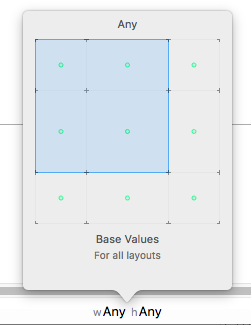
For limited values of “all”.
When designing the storyboards, since I’m still a bit new to Auto Layout, I had naively gone through just laying out UI with the Any-Any scheme. I had a few constraints which were pretty flexible about scaling to different screen sizes and had assumed that was enough. Considering that I’d tested it on a few different sizes which seemed to all work as expected I missed the 3.5" testing.
I made a quick test app to see what devices fell back to Any-Any by creating some simple layouts with different constraints for both Compact-Any and Any-Any. Compact-Any, according to the tooltip in XCode, is supposed to apply to 3.5", 4", and 4.7" iPhones in portrait, but has no mention of the 5.5" phones, so I wanted to see if there was any fallback for the bigger phone. It seems that Compact-Any just applies to any iPhone though, since the app showed that layout for every phone in the simular, not just the non-enormous ones.
So I went back to the drawing board and redid the offending layout using the Compact-Any layout, and while I did so removed all of the stacks which I had used to organise the UI elements. Back when WWDC 2015 was still a new shiny thing, stacks had looked amazing. The more I use them however, the less I like them. They’ve caused me more drama than they have solved due to the limited nature of the content layout, namely that you have control over element spacing, but they tend to try to stretch their children’s dimensions in annoying ways.
So now I’m testing on my iPad as well as my phones, and we’re back to submission! (whenever the bundle finally finishes uploading to Connect)