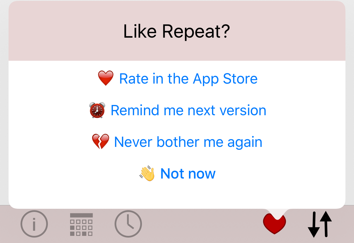
Back in 2014 (and earlier) there was a kerfuffle about the practice of apps being in your face with requests for reviews:
- Wil Shipley @ The Loop
- John Gruber and suggesting one star reviews as a response
- Marco Arment suggesting that a popup request for review should go away entirely
- Todd Zarwell on being somewhat better behaved and showing a popup dialog only on new versions, and after a certain number of launches
I was thinking about this while noodling around with a couple of improvements for Repeat, which has an unobtrusive rating link in the about screen. Whilst wanting to be well behaved, at the same time I think about the number of times I’ve rated apps by using a link in the about screen. I try to rate apps I like fairly regularly since I’m aware the reviews go away when new versions appear on the store, but even so I just don’t think about it when using apps.
Instead, what I am thinking of doing is something obvious but not intrusive. I like the idea of the prompt to rate not coming on the first launch, since you want people to have some idea about the app before being asked to rate anything, and so won’t have anything apart from the link from the about page right away. Similarly I want users to be aware of the option to rate after version updates. On the other hand, I despise the idea of a popup that users have no control over just appearing.
I have two ideas for how to promote rating of an app in a polite manner, let people opt-out if they want to, and also remind on new versions.
Firstly, rather than presenting a popup window, I’m putting in a new UI element that appears some number of launches after install. Since toolbar items are by default a single tint colour (in this case black), the red heart sticks out without obscuring any content or preventing the user from using the app.
Secondly, I wanted to make it obvious as to what each of the options actually did. Very few apps explain whether dismissing a popup will get rid of it for good or until ’next time’ (whenever that is). I wanted to present four dismissal options:
- Rate the app
Take the user to the review section in app store and hide the heart button until the next version. - Remind me next version
Dismiss the heart until next version without rating this version (perhaps the user has already rated it, or just doesn’t care to yet). - Never bother me again
Set a defaults option that prevents the heart from being shown on this device again. Make it obvious that this is a permanent option. - Not now
Just dismiss the popup dialog, keeping the heart in the toolbar.


Hopefully this pattern strikes a good balance with getting the user’s attention without being annoying, lets the user know how to do what they want with the dialog, and more importantly lets them continue using the app the way they want to.