After using the new MBP for a week, I’m coming to appreciate the apps that do a good job with their Touch Bar behaviour. I wrote about Affinity Designer before. Pixelmator uses a similar approach, although it seems to be a bit inconsistent, since it allows you to choose tools, but not all of them.
Pixelmator: Touch Bar tool options
The real heroes that I’ve found so far are Terminal, Preview, and whatever the app is that takes screenshots behind the scenes based on ⌘-Shift-3/4/6 keyboard shortcuts. The default (and optional) buttons for these mostly seem to have been provided to give actual value to a software button, rather than just be there to show that there’s support.
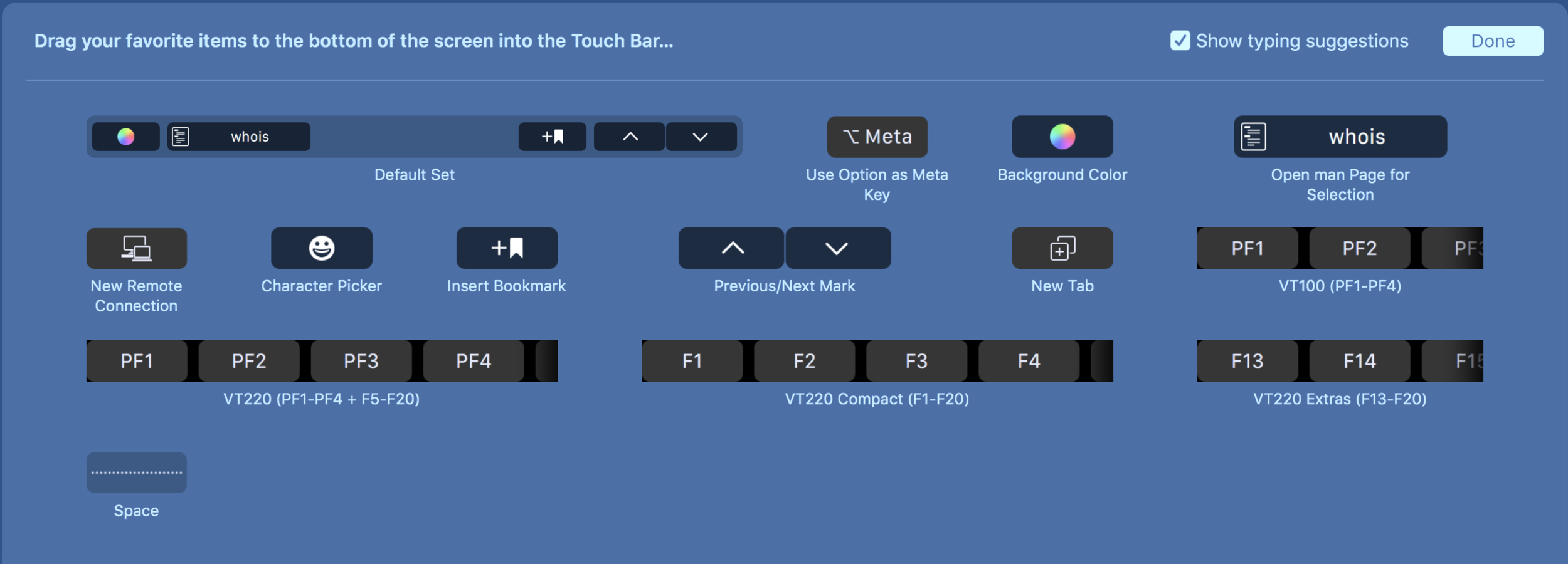
I’m a long time user of iTerm2 (and occasionally Total Terminal), but figured that I’d look at Terminal to see what support was like. The bookmark feature is one that I assume was present before, but I’d never used it, and seems helpful if you are going to want to jump backwards and forwards between terminal history (and don’t want to scroll back either with the mouse, trackpad or something like screen). The real gem is the ‘man page’ button, which will populate itself with whatever you have selected (ho hum, more work clicking) or whatever you are currently typing (win!). I’m useless at remembering command line switches, and so this seems awesome! It opens up the man page in a new window, and so you can be part way through typing up a set of commands and refer to man pages on the fly.


I generally use the ⌘-Shift-4 option for screenshots to capture a region, and I noticed that while I was putting together screenshots for this post, the Touch Bar lit up with buttons. You can switch between different types of capture, and choose different destinations for the screenshots to go (including Mail and Messages which are interesting options). Of course, you can also take a screenshot (⌘-Shift-6 of the Touch Bar while taking a screenshot of a region of the main screen 😆).

Screenshot options

Screenshot destinations
Ultimately I think Preview is the winner for sensible Touch Bar buttons. I’ve loved Preview for quite a while as an app. It’s surprisingly powerful, but keeps out of your way enough to do what it says on the tin: view files (although ever since I discovered Quick Look that has taken over that role). One thing that I’ve always disliked about Preview is getting to the annotation functions, with some (I’m looking at you signatures) being three levels deep if you don’t turn on the annotation toolbar, and keyboard shortcuts that aren’t particularly easy to remember when you don’t use them often.
Preview takes away this problem by giving you the options of switching between the three main annotation options (adjustments, selection, markup - although sadly no signature), with intuitive icons (I didn’t realise Preview had background removal!).


One thing which will need some work is consistency in customisation options for the Touch Bar, since there are some apps which don’t have the “Customise Touch Bar” menu item (Preview being one of them).
The downside is that I keep trying to follow up a selection on the Touch Bar with stabbing at the screen with my finger, although this could be a side effect of using a Surface Pro for work.