Obligatory New Toy Post
Because I have no self control, I managed to justify to myself that I needed an update on my 2012 13" Macbook Air, and bought a 13" Macbook Pro with Touch Bar (hats off to Apple for making the product names roll off the tongue on that one, by the way). 512GB SSD because I spent the last two years trying to juggle space on my Air, and 16GB of RAM because I’m not an animal.
Everyone talks about specs (it’s fine), the clackiness of the keyboard (it’s fine), and where the Escape touch zone is (jury’s still out on that one as far as I’m concerned - I’ll reserve judgement until I’ve spent some quality time in Vim).
So I want to talk about the Touch Bar and the non-clicky Trackpad.
The Touch Bar
My initial reaction to the Touch Bar is pretty unimpressed, given the hype around it, and the initial implementation of support in the apps that I use (Finder, Safari, Affinity Designer, Pixelmator, Calculator, Pages, Keynote, Numbers).
I have a couple of problems with the Touch Bar: one as a concept, and the other on the way that it’s implemented.
My biggest concern with the Touch Bar is the loss of the concept of the tooltip. With unfamiliar icons on the screen I can move the cursor over them and get a description of what the button is all about. With the icons on the Touch Bar there’s no option for that; the best I can do is to go the View menu to customise the buttons on the Touch Bar, where it provides labels for each of the buttons. Obviously this is a bit of a barrier to discovering behaviour of default icons that appear, and to be honest, apart from having icons that are designed to be more intuitive I don’t see that there’s much to be done about it. I know plenty of people (adults and kids that I interact with in my day job of teaching at a high school) who, when presented with an unfamiliar button, won’t press it for fear that it will do something wrong (which I try to combat by fostering an ‘undo culture’, but it can be an uphill battle).
As an aside, VoiceOver is a thing with the Touch Bar, although I don’t think this really counts as a realistic method of function discovery if you’re not reliant on it for general use.
The other concern I have with the Touch Bar is the rather uninspired default actions that seem to come with most software. Safari defaults to thumbnails of tabs, search, and creating new tabs. Thumbnails of tabs sounds sensible until you look at where the names of tabs are: up the top of the window. To see both the (tiny tiny) contents and the title of the page, your eyes are navigating the entire height of the screen if you browse maximised (like a civilised human being).

Affinity Designer: Thumbnails of recent documents.
As one of the few third party apps that I use with support, Affinity Designer actually does an ok job. On app launch, before opening any documents, the Touch Bar is used to display thumbnails of recently edited documents, which is a great idea, since they can be located in different directories and so opening them via the Touch Bar saves time assuming the files are significantly different in appearance. Additionally the shortcuts change with selected tools (with mixed success, for the reasons outlined above about tooltips) with some real standout successes like adding a smooth radius to corners, and some that I doubt I’ll use (changing brush thickness by swiping).

Calculator: A surprisingly useful set of default buttons considering the proximity to the number row.
The Calculator app that comes with macOS is surprisingly good. The proximity of the number line on the keyboard to the Touch Bar means that it can be used almost like a traditional number pad for doing relatively quick calculations without having to move the cursor on the screen. You’ll get nowhere near the capability that people who are scarily good at using number pads are (as an accountant, my wife falls into that category) but it’s better than what we had with laptop keyboards before: either suffering through shifting the cursor around, or occasionally missing modifier keys and hitting = instead of +, 8 instead of *.

Finder: Mostly useless. The “Move To” could be useful if the list of destinations wasn’t just the Favourites folder list from the sidebar.
Where apps have really dropped the ball with what to put on the Touch Bar is by either duplicating a button that is almost always on the screen where your attention is anyway such as the view changing or tag buttons in Finder, or by using buttons that have functions more easily done through keyboard shortcuts that don’t require switching attention down to the top of the keyboard, such as Safari’s New Tab button. The good side of this is that this is easily fixed, either through user customisation of the Touch Bar buttons, or by developers finding better uses.
For the issue of buttons that are either already easily accessible or more easily used by shortcuts, I feel that Apple is suffering from the same problem as Force… I mean 3D Touch on the iPhone. With not all devices having the same hardware capabilities, you couldn’t design software that relied on forceful presses, and instead have to use it as a shortcut for functions that can be achieved through other means. As such, I think developers have been somewhat unimaginative with what they try to achieve with the blend of software and hardware as an input device.
The Trackpad
I am a trackpad addict. I’ve bought two Magic Trackpads (although I converted my wife a bit to effectively and she stole my newer one) and am a shameless tap-to-clicker, often eschewing the use of a mouse to use the trackpad instead. Being able to scroll in any direction through multi touch swipes, activate whatever they call exposé now easily, I’m all for it.
The non-mechanical trackpad is great: it’s bigger, it continues to feel lovely, it’s as responsive as Mac trackpads have ever been, but there’s one glaring exception: not all areas of the trackpad click. As someone who, when clicking and dragging, uses my thumb to click and my index finger to drag, I often find that my thumb sits in the area of the trackpad that doesn’t click. If I know I have to do a lot of dragging, I’ll use both index fingers, so one will click and the other will drag; because of this I tend to try to keep my clicking finger as close to the edge as possible.
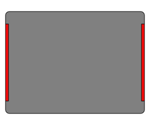
The red zones along the sides of the trackpad don’t seem to respond to clicks.
One of the things I thought we were getting away from with the non-hinge (unhinged?) trackpad was that we wouldn’t be as reliant on where we tried to click as we are when things have moving parts. Hopefully this is something they fix in subsequent models but that’s not much use for something I’m going to try and hang onto for as long as possible.