Every year TV news delights in informing everyone of the tragedies of deaths on our roads, adding to the tallies of state road death tolls and doing comparisons between states and years. I figured that holiday road tolls would be higher than usual, but figured I’d do some digging into the statistics to see just how much worse they were, state by state and compared to the year as a whole.
I went looking for data sources, and found some super-detailed spreadsheets at the Bureau of Infrastructure, Transport and Regional Economics (BITRE) which breaks down each individual incident, the speed limit zone that it happened in, type of vehicle, whether the fatality was a pedestrian, driver, passenger etc as well as date and time (and more). This is all broken down by state and year, and goes back to 1989.
Information on numbers of licensed drivers was a bit of a bust though. I would have thought that the ABS would have had something like that in with the census data, or at least a nicely broken down population by age, which it sort of had, but I was impatient and it would have required a bunch of fiddling to get it into the format that I wanted. I ended up settling for raw population data for each state instead.
Anyway, after some fiddling around in Python getting the data into the format I wanted, I put together a bit of a summary of each year of data broken down by state, as well as the Easter[2] and Christmas road tolls.
The results were, if not surprising, somewhat heartening. The road toll over the holiday periods (the four typical holiday days of Easter: Good Friday to Easter Monday, and three days around Christmas: Christmas Eve to Boxing Day) were significantly higher than the rest of the year, but both the yearly road tolls and holiday road tolls have been dropping year by year, even taking into account the increase in population.
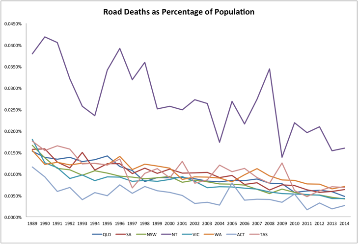
I’ve included some rather ugly graphs to illustrate, state by state, and one consolidated graph that shows the drop in road deaths as a percentage of total state population (although, the Northern Territory, while decreasing is still comparatively way out there).
These each show deaths per day, taken over the year, the Easter break and the Christmas break.
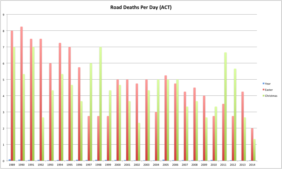
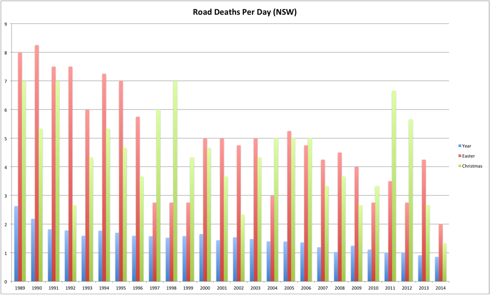
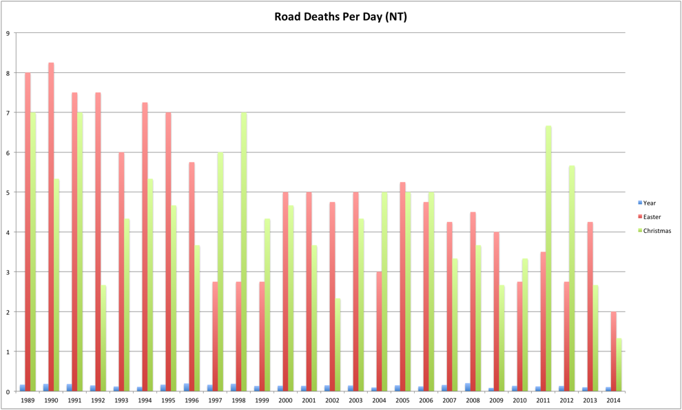
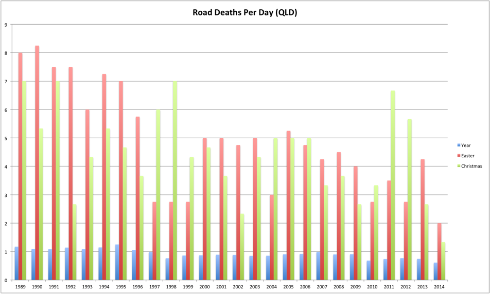
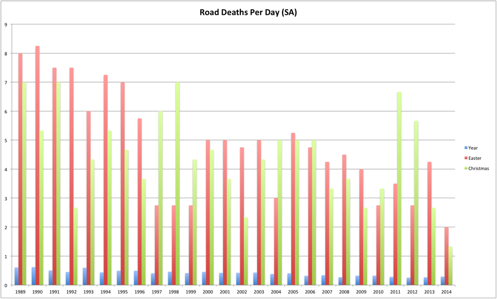
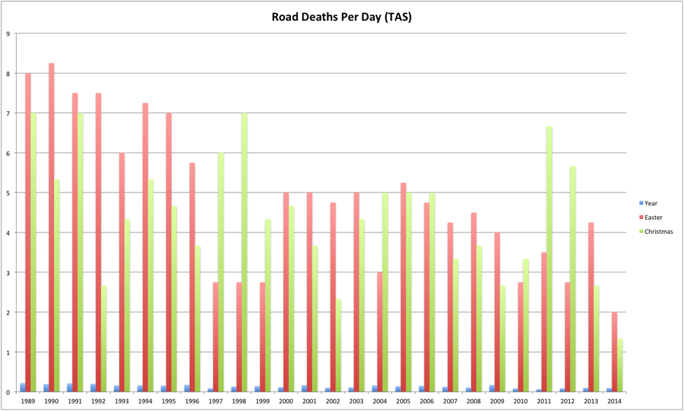
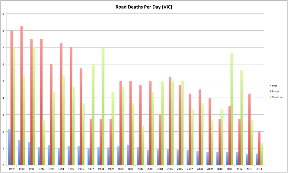
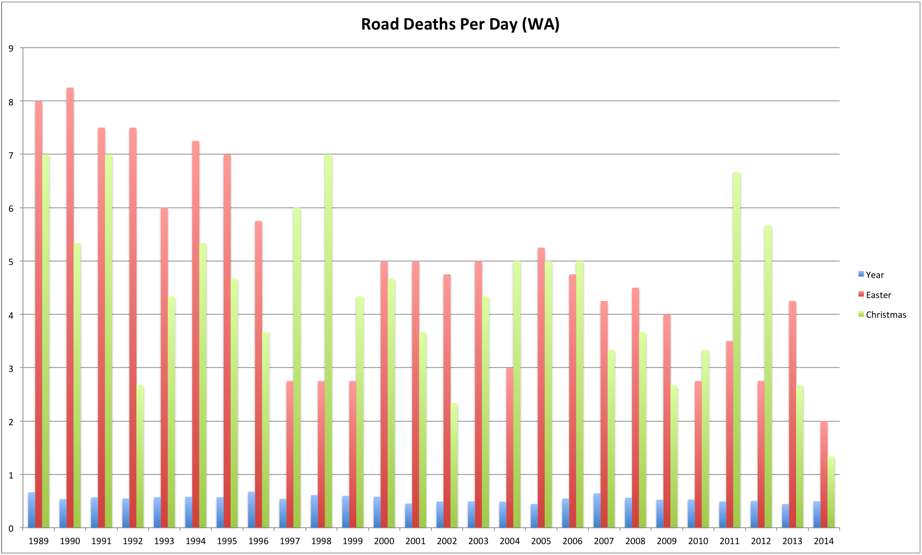
Apart from the relative difference between the holiday and non-holiday periods it is gratifying that in general the trend is downwards.
The final graph shows the trend for all states of deaths per day as a percentage of total population. Again, the general trend is downwards, but as a percentage, the Northern Territory does particularly poorly compared to the rest of the country. When I’m a bit more inclined it’d be interesting to look at what sort of conditions the fatalities in the NT occur in compared to the rest.
There were a few things that I would probably do a bit differently in future. I didn’t remove the holiday totals from the rest of the year, and considering that the holiday numbers are quite high, I think it’d make a bit of a difference. As mentioned previously, it would have been nice to look at what these numbers are like when compared to the total number of licensed drivers rather than total population, although that takes us down a bit of a rabbit hole as far as how to account for pedestrian and passenger deaths. Perhaps in that instance it would be better to look at crash data rather than crash fatalities.
Also my stats skills are super rusty. I probably did all sorts of things wrong here, it’s been quite some time since uni :) Sadly this doesn’t stop me finding it all interesting.
[2] - Getting the dates for Easter was, of course, the worst part of the exercise because of the way that Easter is chosen each year.